About Project
The Problem: The huge success of digital devices along with the rapidly changing economy has created a massive shift of the use from paper and books to digital eReaders. This effect resulted in a huge loss of bookstores in many locations and the collapse of many book companies. The huge loss is what they provided to the average customers. Many readers around San Francisco don’t exactly have a quiet place to sit down, drink their coffee and read. Even though there are many assorted cafes, the loss of places like “Borders Books” that actually had a nice cafe left people longing for it.
The Solution: A San Francisco-based location to bring back the love for books. A place where people can come to read location-exclusive ebooks and enjoy a nice place where they can sit down in a comfortable seat with a cup of coffee.

App Design
The Digibooks cafe App Icon conveys the message of the main logo. With the two letters and a clean design, users will know exactly what it means.
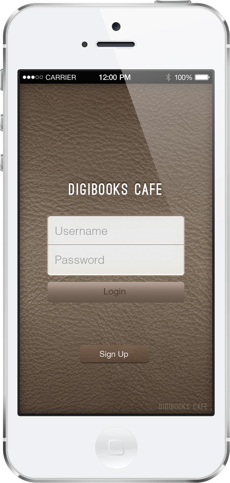
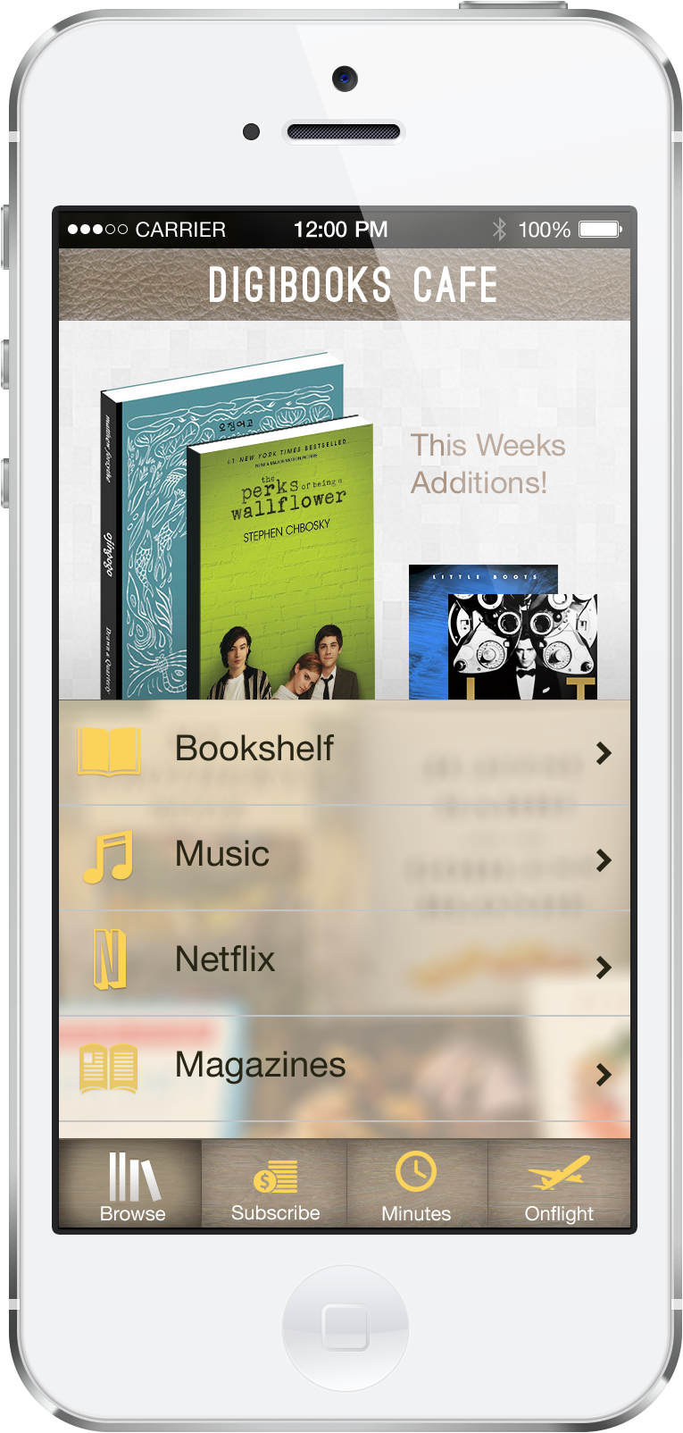
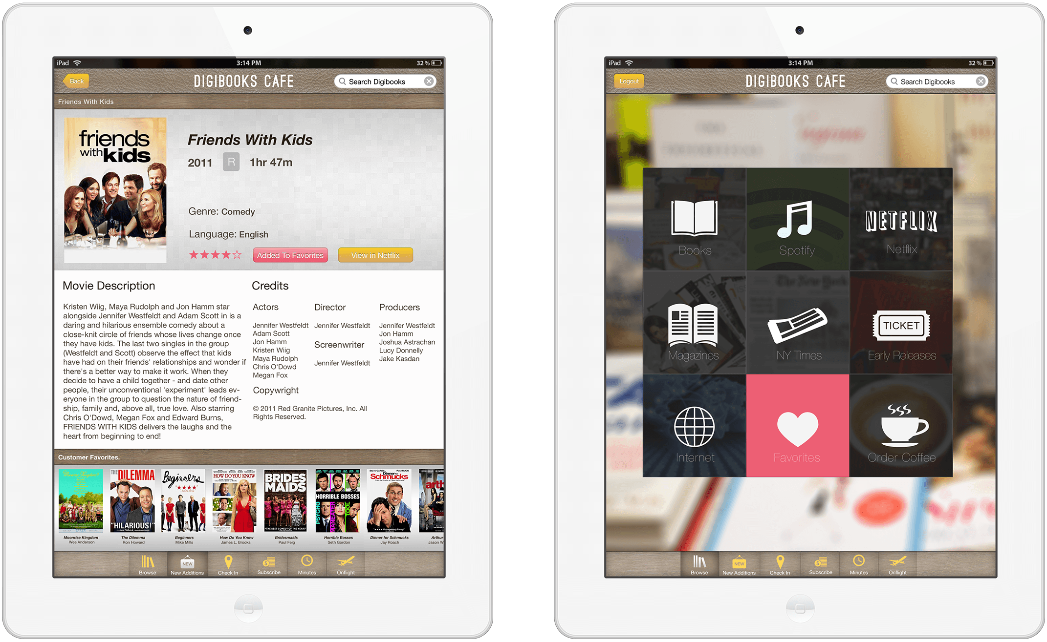
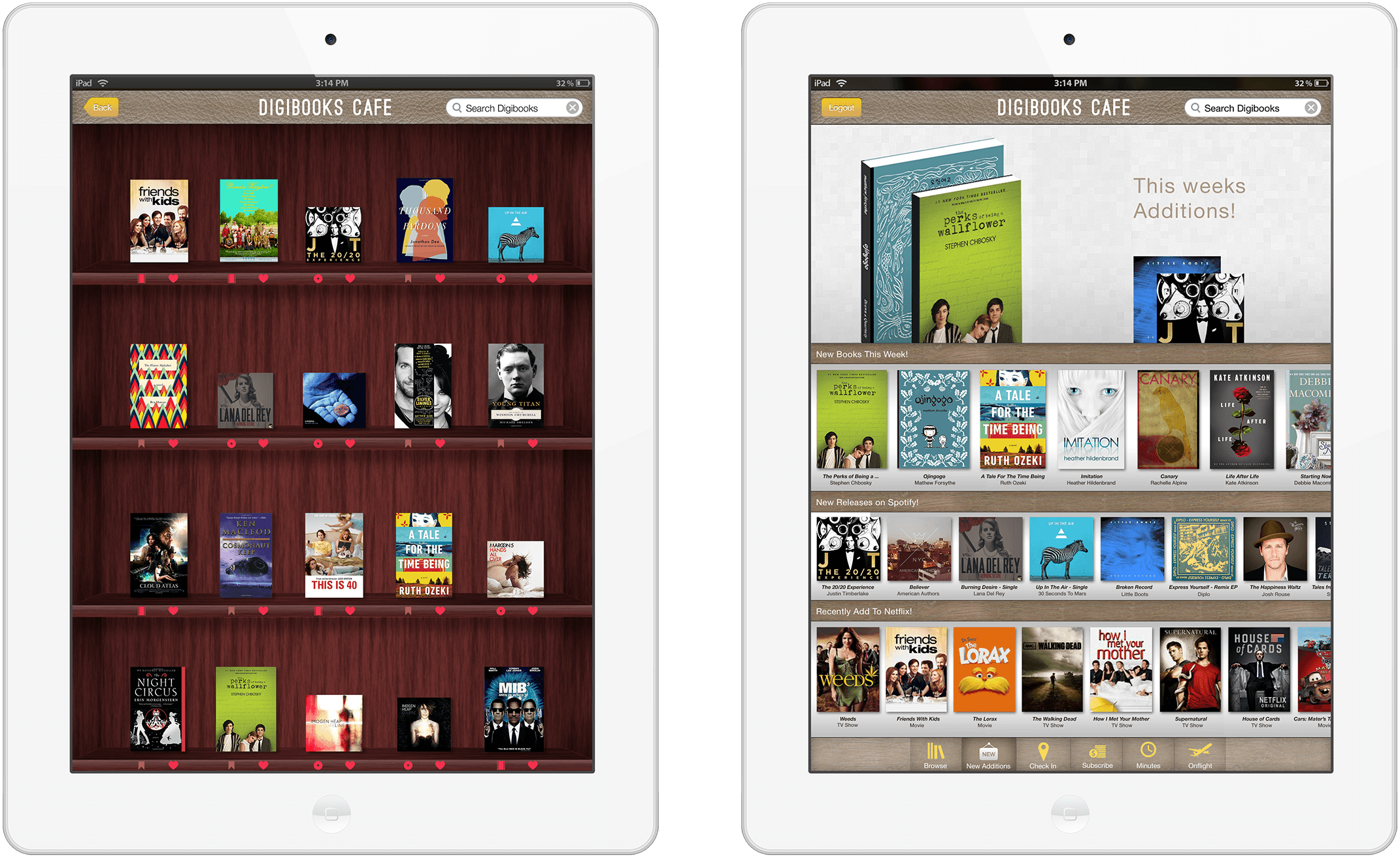
iPad App Design
View App Walkthrough >
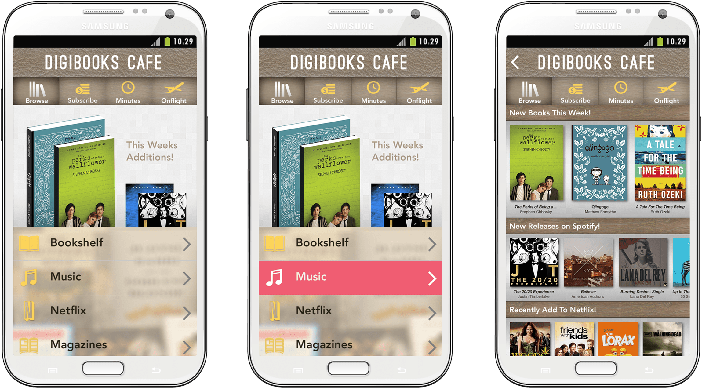
Galaxy Note App Design
View App Walkthrough >